


Design of solidarity postcards for the Heroes collection by Taipō
Behind Taipō’s photography
Taipō is the solidarity shop by the creative firm Låpsüs. The brand was born as a personal concern to put the means of our photographic studio at the service of those who need it most. This solidarity typography initiative arises as a result of the health crisis in order to recognize and thank the work of the professionals most involved during the hardest moments of the pandemic. With this idea in mind, we created the Heroes collection made up of 12 charitable postcards with a typographic design that we made from photography.


In this first Taipō collection, each postcard represents a letter ¨H¨ wich stands for Hero or Heroine –“a person of flesh and blood, who without cape or sword, fights against the invisible threats of everyday life for the benefit of others”– from a professional sector whom we wanted to honor.
Through this solidarity initiative, we want to add our grain of sand in favor of a fairer world. For this reason, the profit from the sales of these original postcards will go to the Red Cross and its national work to reduce the inequalities that the pandemic has increased.


To carry out the project, the first thing we did was investigate what each of the sectors involved did and how they contributed during the lockdown. Once the 12 most exposed profiles had been identified, we got down to work to pay tribute to them. Hence, we recreated their professions through these 12 solidarity postcards.


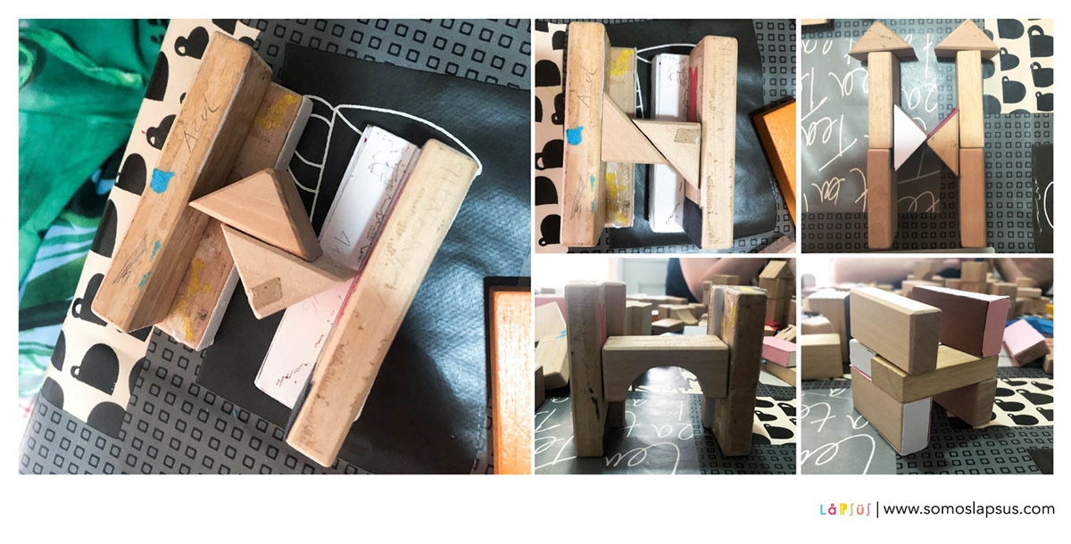
The stages of typographic design: building the letter “H” of hero or heroine of our solidarity cards
For the typographic design, we used the letter “H” that stands for hero or heroine as a starting
For the typographic design, we used the letter “H” that stands for hero or heroine as a starting
point and we personalize it according to the features of each of the selected profiles.
After several tests of shape and volume, we built the final letter using wooden blocks that we cover with colored cardboard and other textures. Resulting in twelve leading H that make up the Heroes collection.
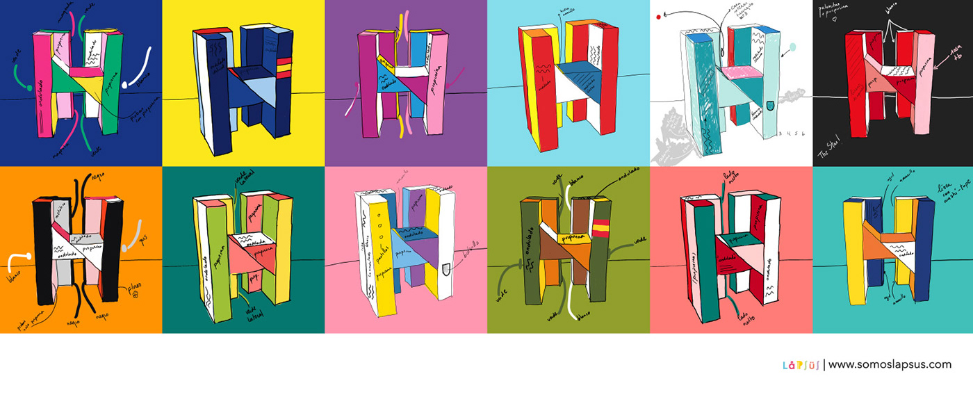
Spreading optimism through the color palette
Once we had the structure of the armed letter H, we worked on the twelve color palettes that would give life to the typographic design of the solidarity postcards. The idea was that each harmony would stand out and convey positive feelings through joyful combinations. Some of them are inspired by the characteristic shades of professional uniforms, while others are inspired by the colors that we associate with each sector and the universe that surrounds it.

Wearing the Hs: a tailored suit for each hero
To finish with the design of each hatch we dressed them in a tailored suit. We divided the letter into sections and assigned each of them the texture and color we wanted to use. Then, we print the pattern of each piece on cardboard, cut out the pieces and stick them on the wooden H. Et voila!
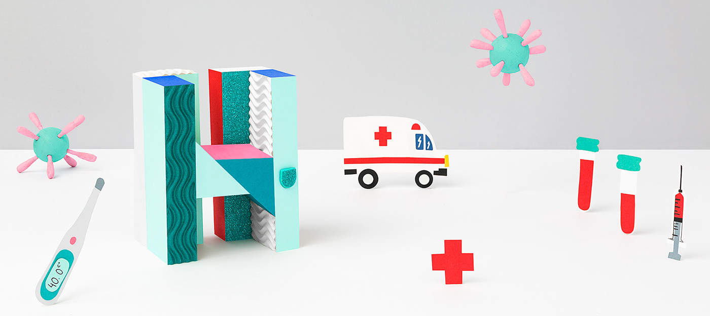
Each H a storytelling of a profession
We decorated each letter with real elements and others made on papercraft, enhancing the narrative of each universe with the stamp of our photographic studio; the mixture of fiction and reality. Through naive storytelling, we staged different recognizable environments around each of the solidarity postcards.

Pandemic dictionary: the words that acquired a new meaning
This solidarity initiative also led us to think about how the pandemic has changed our way of seeing the world and with it, our language. Since then, some verbs, adjectives and nouns have acquired new meanings, adapted to the experiences we had during the lockdown. Going a step beyond design, we thought about these words and collected a selection of the most representative slang of the pandemic to give it a new meaning with a Spanish translation.


Make a difference by going on the generosity train!
Because you too have a caring heart: we welcome you to Taipō, where every person counts. Buy the full collection of 12 postcards or each hero in packs of 6 or 12 postcards and participate in this chain of thanks by sending them a message in your own handwriting.


